Throughout the indie genre there does not appear to be many albums/digipaks that have images of the actual band on the front. They all appear to have some form of artwork of just a plain pattern. I think that this would be a good technique to use for my digipak because it will be a good way to make an easy, effective digipak which could then be made into a magazine advert on photo shop:
Text:
Most of the texts used on the album covers I have looked at all seemed to be the same type of thing: simple and scruffy. As I have chosen the Foals album antidotes as my main influence I decided to focus on the text that was on this album:
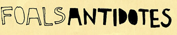
This is the original text from the album which I am using as my main influence for my digipak and magazine advert. It's taken from the foals album. I wanted to use a text very similar to this so I started my saving the images and searching for the text on www.findthefont.com I was unable to find this precise font so I then went onto a website called www.dafont.com and started look at lots of different text types:
FONT ONE:
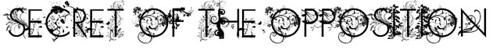
This is the first font I considered using. I really like the simple, straight font of the actual writing that is complimented by the vines and floral pattern. This was my first choice of font but when I typed in the name of the album (shown above) I thought that it was way too much to put on a sketched front cover/magazine advert. I also thought after seeing this that it was too girly for the genre I am doing.
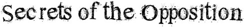
FONT TWO:

FONT THREE:
FONT FOUR:
No comments:
Post a Comment