Wednesday 28 November 2012

Digipak Process (3)

Today I decided to focus on the mouth areas of the front cover. The first thing I done was start to play around with trying to make an appropriate pattern. After finding the pattern I wanted to use on photoshop I used the magic wand tool to select the mouth areas. When using this tool, it didn't get exactly the area that I wanted but I then went to the fill part and after applying the patterned fill effect, I decided that it looked good being a bit 'messy'. (The fill section shown in the pictures below).

The next step I took was to transfer the main image onto a template of a four panel digipak. The first thing I done was download a digipak template off the internet and open it in photoshop. I chose to do a four panel digipak because I thought that it would be the most realistic one to use considering my time frame although I would have liked to make a booklet to go with the finished digipak contain lyrics and extra pictures. After transfering the front cover image to the template, I then created the CD section which was just the same pattern from the mouths made into a cd shape 

Picture 34


Tomorrow is my final editing session which is available for me to complete the digipak so I have made this plan of action to follow tomorrow to make sure it all gets done:
1. Fill in the whole digipak the appropriate colour (cream).
2. Write the track listing on the back (8 songs).
3. Add in all of the record company details and barcode etc.
4. Transfer the main characters drawn image onto the left cover and make
it cover the whole page.
5. Type out the lyrics to the song in my music video on the left cover over the image of the main singer.

Sunday 25 November 2012

Digipak Process (2)

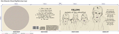
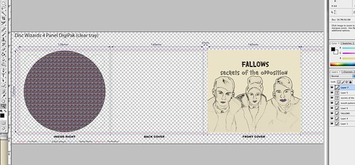
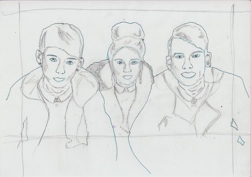
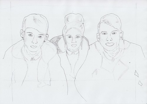
Today I started to edit my image on photoshop. The first I dont was creating a new layer for the background colour. It took me a while to choose the colour for the background and I started off with a mint green colour but I then decided just to use a cream colour like the Foals album. After creating another new layer, I then selected a thin brush (size 4) and went around the only the outside of the image which had alreadt been uploaded to photoshop. I done this only to the outside because this is one of my favourite effects used on my influence album. Next, I selected the shadow burn tool and started to go around the shading of the traced images. I also used the highlighter burn tool as well to make some areas less dark than the ones used with shadow burn. After I had done this I then created a new layer and started to colour in the rest of the image with the same colour as the background, trying not to go over the sketched sections. Next I decided to focus on the eyes of the characters and this consisted of me highlighting the outside sections of their eyes with an offwhite colour (abit more white than the background colour) and colouring the pupils in a darker grey. I done this because I wanted the eyes of the image to stand out. The images below are the screen shots of my first day of making my digipak cover:

Friday 23 November 2012

Digipak Process (1)

Today I began starting to make my digipak. The first thing I had to do was somehow transfer the photograph of the band into a drawing and then onto photoshop. I tried to this in many ways. Firstly, I started off by trying to connect a tablet to the mac computer and draw over the picture as a new layer in photoshop. However, this quickly became obvious that this wasn't going to work. So next I decided to just print off the image and trace it. I started off by tracing the whole image in a blue pencil because the blue pencil doesn't transfer when being scanned and after I done this succesfully, I then went over the image in either a pen or a pencil. I wanted to copy the image from the foals album so I did the outlines of the images in a darker pen whereas the odd shaded sections were done in pencil. Because I wanted it to look like the foals album cover as much as possible I had to add in all of shading and sketchy areas because this would have been difficult to add in on photoshop. I think that this was a could technique to use because when transfered onto photoshop the image looked how I wanted it to. Below are some photographs are my traced pictures: Alyssa_3 Alyssa_2 Alyssa_1

After this was done I decided to focus on the mouth sections which I would have to either create and take a picture of some kind of pattern to go in the mouth sections of the characters. I think by using a bright and colour section of the mouth it will make the overall album cover contrast well. This is because I am wanting to have a really plain coloured background which will probably be a shade of grey/greeny colour. By having this sort of pattern it will stand out alot from the rest of the image. In order to get one of these images I took a few pictures of patterns I made to see if they would look good when transfered onto a computer. After doing this I decided that it would be a good idea to draw some form of pattern on photoshop so it would be much easier to add it into the smaller sections of the image. I chose thus image as an examples of pattern because I think that it is close to the type of thing I want to use for the mouths of my image.

Wednesday 21 November 2012

Digipak Research (2)

Conventional Imagery:
Throughout the indie genre there does not appear to be many albums/digipaks that have images of the actual band on the front. They all appear to have some form of artwork of just a plain pattern. I think that this would be a good technique to use for my digipak because it will be a good way to make an easy, effective digipak which could then be made into a magazine advert on photo shop:


Text:
Most of the texts used on the album covers I have looked at all seemed to be the same type of thing: simple and scruffy. As I have chosen the Foals album antidotes as my main influence I decided to focus on the text that was on this album:
Picture 32


This is the original text from the album which I am using as my main influence for my digipak and magazine advert. It's taken from the foals album. I wanted to use a text very similar to this so I started my saving the images and searching for the text on www.findthefont.com I was unable to find this precise font so I then went onto a website called www.dafont.com and started look at lots of different text types:

FONT ONE:
 Picture 35
This is the first font I considered using. I really like the simple, straight font of the actual writing that is complimented by the vines and floral pattern. This was my first choice of font but when I typed in the name of the album (shown above) I thought that it was way too much to put on a sketched front cover/magazine advert. I also thought after seeing this that it was too girly for the genre I am doing.
FONT TWO:
Picture 39
FONT THREE:

Picture 40

FONT FOUR:
Picture 41

Monday 19 November 2012

Digipak Research (1)

digipak template
What is a digipak?
A digipak is the whole product which we would normally call a CD. it can either consist of 4 panels or 6 and it has all the elements to make a cd front cover and entire case. The style of digipaks range from genre to genre but they all normally have some form of advertisement to promote it. In most cases this is a magazine advert. Below I have analysed two digipaks in comparison to their magazine adverts to show the similarities and differences between them both:
EXAMPLE ONE:
Similarities:
-They consist of the same imagery
-They both have the same brightness/contrast/editing

Differences:
-The CD contains less information
-The magazine advert is larger in size
-The image on the m advert is small because of the information


EXAMPLE TWO:
 
Similarities:
-use the same image
-use the same fonts
- roughly the same size

Differences:
-magazine has lots of writing at the bottom and has the cord label and promotor logo at the bottom
-the tree is slightly smaller on the mag ad. 


It is clear that magazine adverts tend to be the same as the CD but just bigger and with a lot more information on it such as the release date of the album, where it will be sold and who the record company is. This seems to be a good technique to use because if someone sees the picture in a magazine they will immediately recognise it in a shop. 

MY DIGIPAK:

During production I took at few photographs for the digipak I will be making. Out of them all, I chose this one because I think it is a good shot of the band as a whole. However, to fit with the conventions on the indie genre, I will be creating a fine liner drawing of the outlines of this photgraphs and will be using it in photoshop to add in 'artwork' styled images. The main influence for my digipak is the album 'Antidotes' by the band English band Foals released on 24th March 2008. I decided to use this album cover for an influence because I like the simplicity of the images complimented by the small section of pattern. I think that this album cover represents the indie genre very well and it also a very well known album throughout indie music. I think that if I use this sort of technique it would be very beneficial because the audience I am aiming my products at will be able to recognise what genre it is. I also didn't want the digipak I was creating to be very complicated but at the same time I wanted it to be effective which would be a result of doing a digipak like this. Also, the program that I will be using to create my digipak will be photoshop which will enable me to be able to create a digpak like this well.


Even though I have completed a photoshop tutorial before, I wanted to be able to understand the program on a simpler level so when it comes to making my digipak image, I would be able to know what tools are where and which tools would be appropriate for me to use. Therefore, I watched a few photoshop tutorials on YouTube and I found that this one was the most educationally beneficial for me. The main things I learnt from this tutorial was how to create layers and build up an effective image. After watching this tutorial I then went on to explore videos that would show me how to create effects which would be used in the making of my digipak. I found this video the best:
From this video I learnt how to create an image which consists of artwork, images of people and text aswell. This is obviously beneficial because this is what a digipak consists of.

Friday 16 November 2012

Final Product

Last Day of Editing

Today was my final day of editing and the main thing I tried to focus on was making the clips shorter and more jumpy and adding in more footage aswell. Firstly, I started editing the end sequence of the video because I hadn't done much to it yet. I added in a lot of different clips performance and natural, and began to divide them up into 2-3 seconds little clips. Next I added them to the correct places on the timeline. But after playing it back, I realised that I needed to add something more. I experimented with some of the clips already used in the video and came to the conclusion that it would look good with the 'car scene's added to compliment the pace of the music.
After this I started to focus on matching up all of the clips colours and brightness. However, on some clips I added abit more brightness because they were at different locations (I added much more brightness to the car clips because it made the sun stand out alot more).


Overall, I believe that the editing process today and all of the editing in general went well. Although if I had a longer amount of time there are a few things I would have changed. Firstly, I would have made alot smoother transitions from clip to clip to make the video run alot more nicely; but also I would have liked to experiment with more effects such as reversing shots and slowing them down because I think that this would have looked good in the verse sections of the song. Another thing I would have liked to have had was more close ups of the performers because I could have done more editing to shots like this and experiment more with the different colours. The main I think went the best when editing was the cutting up of the footage because I think that although it could have been done more smoothly, the clips ended up being the right amount of length for each beat of the song.

Wednesday 14 November 2012

Editing Progress

This is the second version showing the progress on my music video. The main changes have been the opening sequence and the adding of more footage. This editing was done all after my last day of production:


I showed this video to more of my ideal target audience to get even more feedback to use for my final day of editing. I recorded the responses from 5 different people and the questions I asked were:
1. What do you think generally about the video?
2. Do you think it has improved in a positive way?
3. Did do you think could be done to improve it even further?
4. Did you find it engaging and interesting throughout the whole thing?
4. Did you enjoy watching it overall?

From this feedback, I have learnt that I need to make some of the clips used a bit more short to make the overall video more snappy and interesting. It would also help make the video be more engaging throughout the whole thing. It is also obvious that I need to make the editing (brightness and contrasts) much more consistent and I could even make the natural shot stand out more by making them a different colour to the performance (e.g. black and white) to make it appear to be more 'dreamy'. Overall, the feedback I received for this video seems positive and I will definitely find it useful for my last day of editing.

Plan of Action:

As tomorrow (16th November) is my final deadline I have made this plan of action in order to be fully organised when it comes to my last editing session tomorrow morning:
1. Finishing adding in the remaining footage 
2. Re-colour all of the clips 
3. Make them brighter and more contrasting to eachother
4. Cut some of the footage so they are more 'jumpy' 
5. Try adding in some more effects like reversing shots


Monday 12 November 2012

Production Day 3

Today was my third and final production day. I decided to have one more production day because I really thought I needed more footage. I chose to do this shoot outside because it was a decent day and I thought it would be good to add some shots with nice sunlight in it. The first part of the shoot was the driving section when I was recording a car journey out of the window through fields and down the motorway. I chose to do this because I thought it would be effective to use in the guitar solos towards the end because I have been struggling to find enough footage to go in that section. I also thought it would be good to add some of this footage to the opening sequence aswell. This part of production went really well and run smoothly. It was just one long car journey from Swavesey to Long Road and there wasn't any mistakes made. Also because I recorded the majority of my journey, I gathered loads of footage so even though they were a few bumpy section this didn't really matter because there was enough to make up for it. I believe that this section of the music video could be quite powerful because of the sun shining (shown in the picture). I then went on to record abit more footage at college. This footage consists of the group of friends all individually singing the chorus of the song whilst walking towards me resulting in a close up of their face. This was quite successful however, when it came to editing it didn't seem to blend well with the rest of the music video. Overall, I think that this production day went well but this is only because the weather was luckily decent. If it wasn't the whole shoot would have gone wrong and I would have been able to record anymore footage. The only thing I could have changed about my shoot is that I could have used a tripod for some sections to stop it being so bouncy at times. Also, I think that my time management could have been alot better still because it got to a point again when I was rushing around trying to gather random bits of footage so I felt I had enough to make a full music video.
 
I have created another permissions sheet which was filled out by the supporting actors and the owner of the location that we use when recording. However, not all of the footage I recorded will be used in my editing but I made sure to get permissions. I chose this actors to be in some of my footage because at the time I didn't think that I had enough footage to complete the music video.
In the end I didn't end up using any of this footage because I felt that it didn't fit with the song and what the song was representing. Even though I think random bits can good look in indie music videos, these clips would have been a bit to random to add in at the last minute.

Friday 9 November 2012

Opening Sequence

One of the main things that I have learnt from my feedback was that alot of the people who watched my music video thought that the opening sequence needed more to it. So when I went back to editing, that was the first thing I focused on. I have exported the opening sequence in order to show people how I have improved it and I am planning to get even more feedback from different people:

FEEDBACK!: (I just quickly wrote down their responses)
Questions asked:
1. After watching both the opening sequences do you think it has improved?
2. What do you think could be done to improve it?
3. Did you find it engaging and interesting?

Shaunagh Lee:
1. Yeah, it has definitely improved because more clips have been added to the beginning
2. I think that the colours need to match alot more and maybe make the clips a tiny bit longer instead of it keep jumping from one place to another.
3. I did for the first couple of seconds but I think that there could be more added to it because it should be alot my engaging than what it is now.

Ana D'escrivan-Nott:
1. Yeah it has improved quite alot compared to the last one
2. I think that it could be made alot more eyecatching
3. I personally don't think it's that interesting and I think it would be alot more effective if it was like a sunset of something because that what it sounds like at the beginning. It has improved though but I think it could be made alot more interesting.

James Piper:
1. It does look better and more interesting
2. Maybe edit the clips even more so they go to the beat excatly
3. yeah it was quite good could have more faster clips though


Saturday 3 November 2012

Plan Of Action

In result of looking at the feedback I have received from my music video, I have decided to do another shoot. As I am only needing one more night to record the rest of my footage, the date of the shoot will be Monday 12th October. I will be carrying this shoot out at the same location as before but I will also be recording in a more natural environment with the band. This is because I would like to collect alot more footage and there is only so much that can be done in that enclosed area. Also, if I have 'too much' footage I am less likely to have more issues when it comes to editing. From the editing process already, it has become obvious that using the natural shots give nice effects and fit in with the indie genre aswell. However, because one of my 'actors' is on holiday, this recording session will only consist of two of the characters, Kim and Jack. I am also going to try and record some more close up of the leas singer singing some of the song because I feel that I have got enough footage of that.