Wednesday, 31 October 2012

Carol Vernallis Analysis

Carol Vernallis created a theory on music videos and how they work. She then wrote a book 'The Kindest Cut-Functions and meaning of music video editing (2001)" which has been very influential throughout media education. 
Her theory concentrates on 4 key concepts that all relate to the way a music video is constructed:
1. Narrative
-The video is a visual response to the music
-There is not necessarily a balance between narrative and performance
-The narrative is not always complete – it may be a partial, fragmented narrative
-The structure of the video may appear disjointed
-Something drives the video forward, but often it is not the narrative. It could be the music, the performance, a mixture or some other element.
-There may not always be a clear resolution (closure) at the end
-The video may pose questions that it doesn’t actually answer
-There may be a narrative or theme running through the video, but in a montage style
2. Editing
-Editing may match the musical phrases or the beat
-The video may break or disrupt many of the ‘rules’ of continuity editing – this is a clear convention
of music video editing.
-Editing may become ‘foregrounded – the edits may be really obvious, to draw attention to themselves as opposed to invisible, continuity editing
For example, you may see:
-Jump cuts
-Breaks of the 30 degree rule
-Breaks of the 180 degree rule
-Cutting against the movement
-Cutting within the lyrics
-Fancy edits or cuts
-Extreme jumps in time and space
-Extreme changes in pace
-Juxtaposed framesGraphic matches
-A style of editing that runs through the video and is distinctive to that video
You may not see:
-Smooth transitions
-Matches on action
-An even pace throughout.

3. Camera Movement and Framing
-When it comes to shot types, extremes are very common.
-The style of framing and movement may run through the video and is distinctive to that video
-The camera may move in time with the music
-The camera may move on the lyrics
-The master shot (or other establishing shots) is used frequently, as are close-ups


4. Diegesis
-The diegesis may be revealed quite slowly
-Actions are not necessarily completed – they may be disrupted or interrupted in someway
-Character or object movements may move to the music
-There may be gaps in the audience’s understanding of the diegesis – in time and space,music, performance and narrative
-Some frames may be more important than others
-There may be many repetitions
eg musical phrases, the beat, other musical elements, themes, lyrics, performance,images, colours, camera positions.


I have chosen 'Good Feeling' performed by American artist Flo Rida to deconstruct and analyse using the Vernallis theory:


1. Narrative: This specific music video has very effective narration. The name of the song is 'good feeling' and throughout the video, the life of the artist and his 'good feelings' are shown.

2.


3. The camera work in this music video is very well done. The beat of the music is continuously complimented by the actions of the people within the music video.

Saturday, 27 October 2012

Rough Cut Appraisal

There are many things that I believe went well with my roughcut but I have also personally noticed alot of issues as well. I have wrote this rough cut appraisal to show all of the positives and negatives about my rough cut video and all of my opinions on how it went. I have done this so I can compare it to my audience feedback which will then hopefully help me create a succesful product in the end.

Positives:
- I believe that the clips which I have in my rough cut so far flow well together and create a good representation of what the band is like and how they act naturally.
- The colouring of the footage works well with the song. I dont this by using colour corrector and brightness and I think that it creates a much more 'indie' looking video.
- Some of the lipsynching has work very well and is in good time with the lyrics in the song.
- The lighting in the actual footage works well and gives the overall video a nice effect.
- The long shot performance footage looks good and is a good contrast to the close ups and natural acting shots.
- I think that the beginning bit work wells (when each character is introduced one at a time)
- I believe that the overall idea of the video is beginning to work well.
- The footage that I have got it a good repesentation of the influences that I have been using in the process of recording. e.g: Some of the shots that I have included in my video are similar to others shown in other indie music videos, specifically San Cisco's 'Awkward'.

Negatives:
- I think that so far, the music video does get a bit boring at some parts. To improve this I will need to add alot more performance and natural clips which will involve me doing another shoot.
-Although the clips flow well together, I do think that it is a bit boring having the whole video in the same location and it does get a but tedious. (there is only so much you can do in one location)
-The lipsynching at the beginning needs to be improved (it could be alot more in time).
-The beginning can be improved alot so it's not just focused on a room for 15ish seconds. Even though there is effects added in, it could still be more interesting. The start of the video has to be the part to grab the audiences attention and I want it to be as good as possible.
- Some of the clips in the video seem to be abit 'random' and I would like to change this by having clips from different locations.
- I think that the video would overall be alot more powerful if I had transitions and different effects. At the moment there isn't any really interesting noticable effects added.
- When each character is introduced at the beginning the timing could be more on point.
- The close up of the instruments could be done again but this time it could be made to look alot more natural (like it is shown in the performance shots).
- Some of the clips could be made brighter then the others so they stand out more instead of the whole video because the same brightness.
- Things could be made so they run alot more smoothly (not too much because this would be complimenting the genre of the song).
-More camera angles could be added aswell (of the performance etc.).

Overall, I think that for a roughcut it did go well but there are many things that I need to do to improve my video and make it an interesting 'indie' music video. There are many ways I could do this but I think the main focus needs to be getting more footage for the video.

Wednesday, 24 October 2012

Rough Cut Feedback

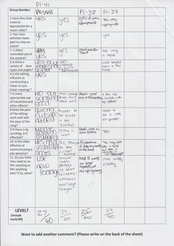
This is the feedback sheet that was given out in class which we then filled out for one another after our rough cuts were uploaded. From this feedback I have learnt that I really need to record and add more footage in aswell as making the clips shorter and putting in smooth transistions between footage. Overall, I think that this is quite positive but constructive feedback aswell.

Wednesday, 17 October 2012

Editing

The first thing I done when I began editing was logging and transferring all of my footage onto final cut. I then filtered through them and deleted any unnecessary material. I then added the song to the final cut timeline and left abit of space at the beginning for any mistakes. I added the best full length performance footage to the timeline and made it match up with the song (lipsynched). After this I began putting 'in' and 'out' marks on the footage to create shorter clips and I then started to add them to the timeline. At this point I was just trying to see what looked good where.
Editing shot 1
The next thing I focused on was adding in the clips that was focused on going to the beat or lyrics of the song. The screen shot below shows the point where I was matching up the guitar melody of the chorus to the close up of the guitar. This took a while because I had to play around with speeding up or slowing down the clip so it fit perfectly in time. I done this by pressing 'command J' and choosing the percentage of speed of which the clip moved at.
Editing shot 2
I done the same thing with the clips which involved the characters singing, this was alot harder then the guitar section because I had to make sure that the singing and lip movement from the footage was excatly in time with eachother and I ended up speeding up the footage by a very small percentage:
Editing shot 3
Next, I added in the rest of my footage into where I thought it looked the best. After this was done I then had to delete all of the audio from the footage I recorded. I done this by deselcting one of the tools on the right hand side and simply deleted the green audio sections on the timeline. However, I did leave some audio in because I thought that it went well with the section of song and it made it look like more of a homemade indie music video:
Editing Shot 3
After all of the clips had been added I started to play around with the colouring of the clips. I done this by using colour corrector and I chose to turn all of the clips a yellowy/brown colour. After this I decided that the clips also needed to be alot brighter so it looked more like an indie performance video so I applied a 1.36 brightness to all of the clips which is .36 more then what they originally were:

Editing shot 4

Editing shot 5

Evaluation of Production

Overall, I believe that my production went well. Even though the first day was not that succesful it stil enabled me to know what I would have had to change anyway. By the first location not working as well as I thought it did it resulted in finding the second location which I feel was a really good location to have. However, I did have some difficulties whilst filming but I think that this is mainly due to me working by myself. Although the actors did help me I think that I would have benefited from having more people there. Another thing I struggled with was getting enough coverage. At the end of the second day production I thought that I had gotten enough coverage but when it came to logging and transfering the footage onto the computer it became apparent that I could have done alot more. I think that is is because I did have a limited amount of time because I could only carry out production in the evening and the office area had to be close by 12oclock.

Production Day 2

Today was my second day of production and I really think that this went alot more smoothly then the first day. As I had a new location there was alot more space to work I didn't feel squeezed into one space and unlike the location yesterday, I was able to move freely when recording instead of having to watch out for cables, instruments etc. The new location also consisted of plain white walls and quite a plain carpet so when the lighting was added it actually made a difference and created some interesting shadows whereas the first location didn't change no matter how much like I tried to add. The main thing though was that I was able to start production alot earlier then the previous day which meant that the amount of time I had to actually record the footage had increased alot and because we didn't feel like we had to rush the process the atmosphere was alot less stressful which ended up resulting in better performances. Because this location wasn't near any houses (when location on day 1 was) we didn't have a specific time to be out of the location by so this also let us take our time with production (it also didn't matter how loud we were).

These are some images from production day two:


After day two of production I have decided that I current do not need anymore production time because I feel as if I have enough coverage to edit my music video successfully. However, if I feel at a later time that I need to do some more recording, I have permission from the owners of the office to use it when I like and the actors all live in this area so they are always available at some point to record more footage if neccasary.

Tuesday, 16 October 2012

Permissions

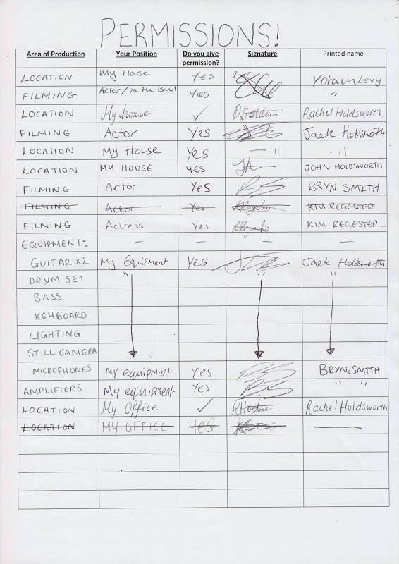
I created this permissions sheet which was signed by everyone involved in the proccess of my production. It covers: location, equipment and filming permissions.


Changes in Production (4) CAMERA ANGLES


Changes in Production (3)

On the second day of production I had to end up using a female drummer. Because I was unware that I would have to have a girl drummer until the second day of production, I had to do some research on how girls in bands are represented.

SAN CISCO:
San Cisco is an Australian four-piece indie pop band, which formed in 2009 as King George in Fremantle, Western Australia. The band consists of Jordi Davieson (guitar, lead vocals), Josh Biondillo (guitar, vocals), Nick Gardner (bass), and Scarlett Stevens (drums, vocals). All members except Stevens share duties on keyboards. In November 2011, the band were signed by Albert Productions. The label describes San Cisco's sound as "rough, low-fi garage pop" mixed with "bright catchy hooks. They made there internet fame with the release of their song 'Awkward'. In this promotion shots the girl is the main focus and is the first person you notice when you look at it. This is because in bands like this you don't normally expect to see a female, let alone a dominant female. However as a band, they don't make an obvious effort to make the girl stand out (e.g. they don't make her wear different styled clothing to the rest of the band etc.). I appreciate this feature of the band because its effortless.  

THE WHITE STRIPES:
The White Stripes was an American rock duo, formed in 1997 in Detroit, Michigan. The group consisted of drummer Meg White (drums and occasional vocals) and songwriter Jack White (vocals, guitar, and keyboards). he White Stripes used a low-fidelity approach to writing and recording. Their music featured a melding of garage rock and blues influences and a raw simplicity of composition, arrangement, and performance. The duo was also noted for their fashion and design aesthetic which featured an exclusive use of a simple color scheme of red, white, and black, which was used on every album and single cover the band released- as well as the band's obsession with the number three. Even though they also had a female drummer, there didn't seem to be a main focus on her. This may be because they are only a duo rather then an actual band. 

I think that the changes I am making in my production is are good because when it comes to making the digipak for the music video, I can have a main focus which is something I can then work around. I think that by having a girl drummer it gives the band a bit of individuality and fits well with the age group I am aiming my music video at.


Change in Actors!
Kimberly Regester:
Kim is also a 17 year old student and she happens to be Jack's girlfriend. I decided to use her as another one of the main characters because I wanted to create a romantic side to the natural shots. Because they have been together for so long it will not be difficult for them to have 'Chemistry' behind the camera. Kim will be replacing Yotam as the drummer.

Monday, 15 October 2012

Changes in Production (2)

The band The White Stripes, an example
of a band that include a girl drummer.
After the first day of recording I decided to change a few things. Firstly, because I had to record for a second day one of the actors could not make it. Therefore I decided to ask a girl to step in as the drummer. I done this because there was no other available drum players in the area that were willing to take part. However, although at first I didn't think that using a female drummer would look right I realised that there are alot of bands that include females. One of the most well known is the white stripes but I have focused on the band San Cisco who has a young looking female drummer. This may also be a good thing because it adds variety and individuality to my music video and could make it more interesting. I also decided to change the location of my music video. This is because on the first day of production I found that the lighting in the first location was not what I wanted. Another resaon why I changed location was because if I changed then I would be able to hire proffesional lighting for quite cheap because the person who owns them is related to one of the actors. However, the lighting couldn't be moved to a different location because the second location was used for actual photography. Another good thing about the second location is that it was a plain white space which had alot of room which allowed us to have a spacious set up. The lighting that I used was a proffesional lighting with barn doors and umbrellas. This lighting is specifically used for outputing alot of light into wide spaces making even lighting throughout the space, causing little shadowing. But before using the lighting I thought it would be beneficial to watch some videos on how to use umbrellas in the right way. I found this video the most useful to me:
This video was specifically useful to me because I've decided to add a different shot type into my music video. This shot will consist of each member of the band standing up against a plain background with the lights on them singing through the whole song. By doing this I will hopefully be able to edit it in a way that on the chorus for each word it's a different person singing it. The best example of this would be 'nothing on you' by b.o.b when it changes from different pictures of girls on the chorus. There were also a few costumes changes due to me not being able to get hold of certain things such as the hats because one person was not available. However, this doesn't seem to be that much of an issue because I am still able to get hold of the obvious clothing tshirt. The last change in my production was that I finally decided not to include a storyline but I want to record the band setting up the equipment and just acting naturally around the location so I could maybe add this into some parts of the editing. This has been done before by many different genred artist but I got this idea from the music video 'Give it to me' performed by Timbaland, Nelly Furtado and Justin Timberlake (specifically towards the end of the video).
Another example of this type of music video is 'Cheers' performed by Rihanna:

Even though it is not in the genre of music I am doing, I think this is a good example because it shows that you can show natural behaviours such as talking to one another and it would still go well with the music as long as its relevant. By doing this its makes a music video look more 'home made' which is popular throughout the indie genre.Overall, I believe that these changes in my production will be alot more benficial when it comes to the editing process and the end result as a music video product.

Production Day 1

Today was the first day of me attempting to record my music video. unfortunately this did not go very well. Firstly, my schedule had to be moved to later in the evening because one two of my actors had to attend a staff meeting at their workplace. The drawback of this was that I wasn't able to use outside as a natural source of life. However, at my location there was alot of lighting which I tried to work with. This ended up being quite a good thing thing I was able to play around with the lighting rather than it coming from just one place. Luckily the equipment that I has to use belonged to the owners of the location and they had no issue with me using this so I just added the lighting to the permisson sheet I produced.

However, even after using this extra lighting I still wasn't happen with how the location was looking. When thinking of this a music video for this song I think it should be really light and bright colors whereas because of the timing, my location looked dull. This would be suitable for some form of indie video but not mine. Another issue I had at first was managing everything by myself. However, the people who were acting in my music video had no problem helping me move all the equipment and setting it up. Also, the outfits I had originally decided to use in my production didn't fit all the actors in the same way so we had to make the decision for everyone to wear some of their own clothes; this ended up not being such an issue because their styles matched the style I wanted it to be like anyway.

In the end I didn't actually end up recording any footage because I wasn't happy with the set up and timing of the set. However, this time did help me realise any obstacles I was going to come up against which then helped me to make a detailed plan for my next night of production. I also decided to change a few things in order to make it more convenient for me on the day. Below are a collection of images from production day one which shows the process of setting up the location:
 
This is one of the sides of the room
at my location. 
We cleared out the whole location in order to set
up the equipment how I wanted it. 

This was the beginning of the set up (this 
This is the point where we decided to sit down a reevaluate. 
 

Sunday, 14 October 2012

Actors

In my music video there are many people acting in it. However, there are two main characters that I want to have a main focus on throughout the whole video.

Jack Holdsworth:

Jack is a 17 year old student who I thought would be perfect for the role of the main singer of the band. This is because he has the exact look of someone whos in an indie band but he also takes part in a lot of acting which would be beneficial when it comes to recording. He is also in a few bands himself which he is the lead singer in. Lastly, he happens to be a very big fan of Two Door Cinema Club so this could be reflected through his acting.


Yotam Levy:
Yotam is a 18 year old student from long road. He's acted in some other students music videos before but students from uni. He has also dome some 'modelling' for photographer students at my college and he adapts well to any situation he is put in. I chose him to be one of my actors because he's a really enthusiastic person and loves getting involved in projects so he could bring some good ideas to the table.


Bryn Smith:
 Bryn is an 18 year old student who loves music. He's been in a student music video before so he knows how to act infront of a camera but he is also best friends with Jack. This is a positive thing because when creating a 'band' image, I want them to actually look like a band and I think that this is very possible because they are all friends and have the same interests. Bryn also dresses in the 'indie' style and he used to play the bass aswell. Another reason why I chose these actors is because they all live very closely to eachother which will be useful because it will be easy to get them together when neccesary to record the video.

Friday, 12 October 2012

Lighting Tutorial


After watching this lighting tutorial video I have learnt many things. The main thing I have gained from watching this video is that if you want to add lighting to a location you don't have to do it directly from the front. by using lighting in the background it gives the overall footage a much nicer effect. This lighting technique seems to be popular throughout indie performance videos. Even though it seems to be a simple thing to do, I think that I could use these lighting techniques in my music video especially when doing close ups of the actors and the instruments to give an nice extra effect to the overall video. I think that using something so simple like putting a light behind someone instead of infront are alot more effective then trying to use dramatic lighting and effects. And these simpler things are what are used alot more in indie music videos.

Digipak Research


Blur album artwork by Julian Opie
Bombay Bicycle Club Album
Many bands have used famous artist to create their digipak such as Blur who had one of their most famous album cover created by well known artist Julian Opie. I personally think that the blur album cover is one of the most influential and iconic digipaks to ever been created. This is because although it appears to be simple at face value, it does have a great attention to detail aswell. This album cover shows the whole band as equals which in contrast to other digipaks there is always a main person for the audiences focus. The colours used on this album cover are very effective aswell. They are very plain, primary colours but they contrast well with the darker colours of the characters. This cover is also very eyecatching because of the colours. However, Blur weren't the first band to do this it started with Queen in the 80's. This is the first digipak I looked at from the indie genre. This is Bombay Bicycle Clubs third studio album to be released and wasn't the most popular. However, I found this one to be the most appealing because it is simple and doesn't include an image of the band themselves. I think that the best feature of this digipak is the c.d. because it is a direct pattern copy from the 'brain' on the front cover but it covers the whole of the c.d. which makes it stand out a lot. This digipak like many others from the indie genre this album is based on art work. This artwork was made by someone who works for the record label that Bombay Bicycle Club are signed too. This makes it more noticeable because it is an unrecognized artist which could be more intriguing. The fonting is very simple and consist of white capital letters ontop of a dark blue background. The use of these contrasting colours makes the text stand out well from the rest. However, the best feature of the digipak is the pattern 'brain' section. This consists of warm colours in a consistent pattern. All of these things together look nice but its questionable what it's supposed to be representing. However, if you are a fan of Bombay Bicycle Club you would appreciate the simplicity of this digipak. This could become an issue for me when making my digipak because indie digipaks do not tend to create a representation of a star.


Two Door Cinema Club-Tourist History: 
This is the first studio album released by two Door Cinema Club called tourist History. the digipak was created by an artist hired by Kisune Music which is TDCC's second record label. This digipak is much alike the Bombay Bicycle Club cover but it uses a different range of colours. However, this album cover uses the same effect by putting pure white text on top of a dark background (and then the opposite on the back of the album). I think that this digipak represents indie pop music quite well. The artwork is quite abstract and it is questionable what the meaning of it is but the whole digipak consists of the same artwork (shown on the actual cd) so it does work well. However, the back of the digipak is different to the front because it is a really light colour with dark writing which makes the front and back contrast; athough the colours used are still  consistant.
From analysing these digipak I have noticed that indie, especially indie pop bands, don't tend to use a picture of themselves/the band for the front cover. This is no surprise as they always go for the more simple things so the focus will always remain on the music. This is a huge contrast to the digipaks which I analysed at the beginning of the blog which was focused on rnb girls digipaks which showed the complete opposite. For the digipak that I will be creating to go with my music video I think that I would use a picture of the band instead of getting some form of artwork. Even though I would like to be able to create an individual artwork piece I don't think that this would be possible given the time frame that I am in. However, I won't be using a glamourous shot of the band it will be simple with some editing to compliment it. To the left of this paragraph is a picture of the band San Cisco who I have looked at quite abit through my research and planning. This photograph is more of the type of picture I am wanting to use on my digipak instead of artwork.
 

Wednesday, 10 October 2012

Product Placement COSTUMES


Product Placement- OBVIOUS? CLOTHING
I wanted include some form of product placement in my music video. I didn't think it would be appropriate to use the newest 'flashy' phone like they do in some videos and it would also be very hard to get permissions for this. I decided to contact one of the students who goes to Long Road who has set up his own T-shirt company within the past sixth months and I asked him whether I could borrow one of his T-shirts to include in my video. His brand is called 'obvious?' clothing and it has become quite successful throughout our college and is already well known in Cambridge by teenagers. Harry reaches out to consumers by using social networking such as twitter and facebook but he mainly uses tumblr. (http://obviousclothing.tumblr.com)


I asked Harry for the permission to use his clothing over a facebook conversation.


This will be particularly eye catching to 'hipster' styled people because obvious clothing is in many ways quite similar to the brand 'hype' which is a well known brand to teenager consumers. It is an only recently discovered clothing brand but had been around for a couple of years. It was created by two boys around the age of 20. It has blown up over the past couple of months and teenagers appreciate the clothing line because it is different from anything you can get in the highstreet shops and its noticable/rememberable. The majority of the clothing consist of a plain white tshirt with some sort of pattern logo on the front or just the brand name. The tshirt I will be using will be very similar to this.

After having a conversation with Harry at college he told me that I had to include a short clip of him in my music video wearing his obvious clothing for letting me have some of his merchandise.

Costumes

I have made this prezi presentation to show the clothes similar to what I am wanting my characters be wearing for my music video. I believe that these outfit choices represent an indie band well but also give the band a youthful style aswell:


These are some examples of supreme hats
I have also decided to make some changes to the styles which are not shown in the presentation above. I think that because I am using teenagers to perform in my video, I should use some popular trends aswell as just copying indie bands. I think that it would be a good idea for some of the characters to be wearing hats. Specifically, supreme hats because alot of people wear them and it is a well known brand. I wanted to use these because I think that if people are watching my video and can recognise certain things then they will find it more interesting and would be more willing to continue watching. These hats are normally quite expensive but luckily I am able to get ahold of some because alot of my friends own them.

Instagram Effects


From this tutorial I have learnt that there are many different things that you can do with final cut. The instagram effect is very popular at the minute all over social networking sites as well as instagram such as twitter and facebook. This effect also makes videos look vintage and 'less-proffesional' which I could benefit from considering that I am using quite plain locations with a camera that wouldn't be used to record high budget music videos. If I added this effect it would make the video seem like it is supposed to be of low quality which also compliments my genre of music aswell. From some of the audience research I have done, alot of people have said that they imagine sunset and beaches when lsitening to 'This is the Life'. This instagram effects adds this sort of feel to footage which could be benficial to me aswell. By adding vintage filters to footage it also enhances some of the colours like blues and reds. This could be good for me because I am filming my video in an inside location but the natural light could be enhanced by this effect well.

This is an example of an indie band using  thevintage filter effect in their music video:

Theoretical Studies Into Audiences

1. USES AND GRATIFICATION:
Blumler and Katz argued that audiences are ACTIVE and not PASSIVE and approach and use media products for the following reasons:
-DIVERSION: a form of escaping from the pressures of everyday
-PERSONAL RELATIONSHIPS: where the viewer gains companionship, either with the television character or through conversations with others about television.
-PERSONAL IDENTITY: where the viewer is able to compare their life with the lives of the character and situations on television, to explore or question their personal identity.
-SURVEILLANCE: where the media are looked upon for a supply of information about what is happening in the world

2. FOCUSED AND AMBIENT AUDIENCES:
David buckingham explains that some audiences are not as deliberate or active in their consumption. He believes that it is essential to situate young people's media use within the context of their social activities and experiences due to the face that many young people are using media as a wallpaper; a wall of noise to fill up 'down time' or just to pass the time due to boredom/ That many of their interactions with the media are not committed or concentrated but they are meaningless. 

Why would an audience approach/use my media product?
I believe that an audience would approach my media product because they have an interest in the genre of music (indiepop). Alot of indie music is promoting through the use of social networking and YouTube so the audience that would ideally watch my video might be likely to approach my product. I am planning on having my music video uploaded to YouTube but then I am going to make people aware of my product using social networking sites (mainly facebook). They might also approach my product because they already know the song and the band and are intrigued to watch it. Lastly, I think that audiences from my college will approach my media product because they are interested to see what other students from their school have done in their lessons.

Music videos are made for PROMOTION of bands and they are made to create a representation of the artist/band so the video should to catered to their type of music that would be suitable for their audiences.

Focused audiences would take interest in music videos that include: detail, meaning, strong narratives, good effect use, innovation etc.
Ambient audiences would take interest in music videos that include: simple narratives, strong performance, lots of costumes, quick location changes, non-linear editing, quick editing etc.


How will I be accommodating for these two types of audiences? 
I am aiming to accomadate for these two types of audiences by using detailed and meaningful footage but by using quick editing and strong performance aswell. Hopefully, this will then enable me to create a music video that will be enjoyed by both types of audiences. Overall, I think that my music video would appeal to both these types of audiences because I am planning to involve a mixture of their interests such as good effect use etc. However, I am hoping that the majority of my audience is ambient audience because I think that my music video is going to accomodate their interests more than focused audiences.

Audience Research (continued)

THE IDEAL AUDIENCE TYPE:
  • The age range for my audience is 16-24 (mainly teenagers).
  • Both genders-but mainly female because it is a all male band and it is an indie pop song. 
  • People who enjoy going to festivals and seeing bands (e.g. Latitude)
  • Who fit into the whole 'hipster' thing. 
  • An audience that follow the indie fashion and trends (lots of denim, shirts, vans etc)
I have decided to focus on females as the ideal audience and have created this prezi to show the ideal girl that would watch my video. This prezi shows their types of hobbie, food etc:

Audience Research

As part of my audience research I have asked students around Long Road their opinions about the track that I am making my music video for. I have recorded their responses on video and the questions I asked were:

1. Did you like the track?
2. What type of person would like this track?
3. Which age range would you typically associate with this song?
4. How would you picture the band/lead?
5. What sort of music video would you expect to accompany this track?
6. If performance, where and what type?
7. If narrative, what sort?


From this research I have learnt many things. Even though I asked different ages and type of people, once listening to the track 'This Is The Life' they all seemed to have the same sort of ideas about the song itself. They all thought it was a happy upbeat song that would have a performance in the music video. Interestingly, two of the people thought of a beach themed music video after listening to the song. Luckily, the ideas of what the band/lead singer would look like seemed to match my initial ideas so I wouldn't have to change anything in that area. From this research it has given me alot of extra ideas to add into my music video.

Tuesday, 9 October 2012

Breakdown Of Production

Two Door Cinema Club-This is the life:
This is a rough plan of how I am going to carry out the recording of the music video. I have done the performance plans for the whole song because I am planning to get coverage for all of it so when it comes to the editing process I wouldn't have missed anything out and will hopefully avoid any issues that could have occured:

PERFORMANCE SECTION:
(0.00-0.18)
  •  The screen is going to be black and the audience is going to be revealed to the setting by the light in the room being switched on by the drummer in the band.
  •  The drummer goes over to the drum kits and starts playing the beat; he is then joined by the bass and guitarist. Lastly, as the music picks up pace the main singer gets into place aswell.
(0.18-0.47)
  • As the song begins, the camera remains as a long shot so the band is all scene but then it goes to a side close up of the singers face for a few brief moments.
  • In this section there will be a few brief close up of the instuments to compliment the melodys in the opening part of the song.
(0.47-1.08)
  • As the first verse begins, there will be focused close up on the main singer but still showing some of the background (blurred out) so it can be focused on the lyp synching and the lyrics.
  • It will then zoom out when the first verse is coming to an end.
(1.08-1.14)
  • This short section is going to go back to the focus on the other band members and there instruments.
  • This will include close ups and extreme close ups.
(1.14-1.22)
  • This is the first performance of the chorus and it is going to show all the band members singing in the microphones because in the song, they are all inputing to this part.
(1.22-1.28)
  • This is when the focus is going to be on the guitar melody and will show the guitar being played by one of the band members
  • This could also include quick shots of the drums which are also a key part to this section in the song.
(1.28-1.44)
  • The same thing is then repeated for the second repititon of the chorus
(1.44-2.04)
  • This shot is going to be focused on the lead singer again but will consist of close ups and midshots so it can show the instruments being played aswell.
  • As the song starts the 'doooo' part, the camera is going to change shots to the other members aswell to show their singing of the sencond verse before the chorus.
(2.04-2.54)
  • This section is going to be a mix of the things above because I this point I am planning to add more of the other section of filming to help build up to the instrument solos which come up next.
(2.54-3.27)
  • The instrument solos are going to focus on close ups of them being played. This will include all of the instruments but one of the main focus will be the drum being played (only showing the hands of the drumist and the drum)
(3.27-3.31)
  • This ending part is when the music dies out.
  • I am going to do a long shot of the whole band finishing playing the song and beginning to look around at eachother and begin chatting (the sound will not be heard)

I am going to carry this out by recording the performance several time but each time I am going to focus on different areas (angles) of the performance. This may become tedious but atleast I will get the coverage that I am wanting to get.